Another cross-post. Gotta go…
Indexing a Book Is Hell

Author
Another cross-post. Gotta go…

Not quite a launch. Not quite a rant. Just one author trying to get a novella into the world without sacrificing too many hours or brain cells.
I’ve been writing quite a bit lately—several novellas/novelettes, to be precise.
They all began life as short stories, but brevity doesn’t come naturally. Apparently, I can’t shut up even on the page. I toyed with the idea of releasing a thematic collection, and I still might. But for now, Sustenance is getting its own debut—likely this month.
The book clocks in at around 14,000 words, printed across 144 pages. I’ve read that readers prefer novels to novellas, but I’ve also read that readers don’t really read anymore. Time’s short. Attention spans are shorter. Maybe shorter fiction has a fighting chance. We’ll see.
I formatted it in 6×9 inches, which may have been overly generous. It’s leaner than your average indie fantasy tome but still thicker than my last Žižek collection. So there’s that.
The manuscript began in Word, like every poor decision. I laid it out in InDesign and exported the PDF through Acrobat. No budget, so I designed the cover too—started in Illustrator for the vector charm, but ended up in Photoshop, where I’m more at home. I designed the full wrap—front, back, spine—as a single canvas.
This was a mistake. More on that later.
Still, I’m pleased with the final look. Might reuse the style across future novellas for a bit of visual branding. There’s barely enough of a spine to print on, but we suffer for aesthetics.
Proofs arrive Thursday. Fingers crossed.
Then came the hardback edition. Same 6×9 size, same interior. Should’ve been simple.
It wasn’t.
I forgot (again) that hardbacks require extra bleed and margin space. Couldn’t just resize the existing cover without risking pixelation. If I’d stuck with vectors, this would’ve been a breeze. Instead, I got to rebuild the entire layout from scratch—layers, guides, grids, the lot.
Hours of joyous rework. Lesson learned. Until next time.
Converting the layout to eBook format was a slow-motion trainwreck. I’d inserted custom font glyphs above chapter titles in InDesign. They rendered fine—until they didn’t. Halfway through, chaos reigned.
I cracked open Sigil and manually edited the XHTML. So far, so fiddly.
Then I uploaded the .epub to Amazon. Except Amazon wanted a .kpf file. Of course it did.
Enter Kindle Previewer. Except it doesn’t support embedded font glyphs. So I converted them to SVGs.
Still no dice. Kindle’s rendering engine is older than most of its readers. SVGs failed too. So I converted every glyph to PNG, rewrote the CSS, rebuilt the XHTML again, and gave it another go.
Looks fine. Not perfect. I gave up.
They’re just decorative anyway. No plot-critical glyphs here.
The Kindle version should go live shortly. I enrolled it in KDP Select, which means 90 days of exclusivity in exchange for a modicum of convenience. After that, I’ll look at wider distribution.
For the eBook cover, I simply cropped the original layout in Photoshop. That part was, mercifully, straightforward.
This post is more documentation than declaration. A sort of production diary. I’ll follow up with an actual announcement when the book launches, plus a few reflections on themes, characters, and that moment when you realise your protagonist may have accidentally sexed up a chicken.
Long story.
Anyway, this is just the start. Stay tuned.
Or don’t. Up to you.

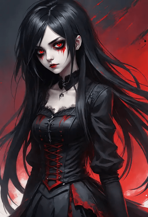
I just completed a second draft of a novelette I’ve been working on. I had ChatGPT (Dall-E) render a quick sample cover.

A young woman stumbles across an unconscious man on a remote highway outside Anika, New Mexico. He’s naked, tattooed, breathing — and utterly incomprehensible. Medical professionals, police, and a determined psychiatrist try to parse his language, but his words follow rules that don’t exist and reference a world no one knows. As they struggle to decode him, they’re forced to reckon with the limits of their own assumptions, both linguistic and moral.
Temporal Babel explores the failure of language, the fragility of identity, and the quiet panic that sets in when comprehension fails.
The story takes place in New Mexico, and I wanted a minimalist visual style to match the prose. I believe that a beige desert set against a blue sky is perfect. The deserted highway with a single cactus speaks volumes. The footprints in the desert are also evocative. I love the simplicity of the palette.
Though it revered the front and back cover art, it generally followed my instructions. Artificial intelligence (AI) has made significant progress in a year. All of the words are spelt correctly. I could Photoshop this into shape with little effort.
I only plan to release this as an ePUB because I am compiling a triptych. Currently, the body copy stands at 105 pages, so with title pages and the rest, it should reach 112 pages, which is perfect for seven 16-page signatures.

My biggest problem with generative AI is its lack of subtlety and misunderstanding of satire and irony. I am writing a short story, and a character is calling an emergency number. I shared the first scene with Grok, and it suggests that I turn the absurdity up to 11 and replace this segment with the one above:
“Okay, ma’am. Can you stay with him? I’ll dispatch an ambulance to your location.”
It is funny in its way, but I’m only pretty sure that an operator would not be injecting humour into a situation where a woman is reporting an unconscious person. Absurd doesn’t need to be Monty Python funny.
Am I being too critical?
More to the point, I find that many humans miss subtlety. Many people need every storyline highlighted and retraced with a bold Sharpie. Every detail needs to be explained because they can’t connect the dots. This is reflected in the cinema, television, and books of the past half-century or more, so is it fair to criticise AI for being dull when it’s at least on par with more than half the human population.
Are we asking AI to be held to a higher standard?

Writing is hard. Short stories are worse. I started Mind Without a Mirror a few days ago as a short story project. After a dozen major revisions, I got to a place to run it through AutoCrit. I’ve been using AutoCrit for a couple months, and it’s been useful as an editor before I connect with a human editor or Beta reader.
Today, I think it split its guts. I clicked on the Character tab. This is where it assesses your character traits, strengths, weaknesses, and some other aspects. As you may notice for the first character, Ada, it returns a terse response. This is usual. The second character Echo went off the chain.

Major characters including Ada and Echo provide contrasting perspectives aiding in highlighting different facets of conflict surrounding Sol’s disappearance:
1. Ada – Her impulsiveness offers tangible counterpoints but sometimes lacks depth behind motivations driving rash decisions; deeper backstory integration can enrich relational dynamics while avoiding plot holes associated with seemingly arbitrary choices leading toward unnecessary risk-taking scenarios without sufficient narrative justification.
2. Echo – As a voice urging caution yet pushing boundaries intellectually rather than physically contrasts effectively against both Ada’s impulsiveness and initially hesitant nature exhibited by Nova; further scenes emphasizing logical deductions alongside emotional intelligence contributions can elevate effectiveness within group dynamics exploring unknowns collectively ensuring smoother narrative cohesion devoid apparent gaps particularly during critical junctures necessitating unanimous decision-making processes amongst protagonists’ circle thereby mitigating potential dissonance arising from conflicting individual agendas undermining collective objectives pursuit efficiency notably during climax build-up phases preceding resolution stages inherently reliant upon concerted efforts fruition realizing overarching goals set forth early onset storyline unfolding sequence events trajectory mapping course eventualities encountered en route denouement culmination point reached conclusionary chapter segments encapsulating thematic essence distilled core message intended conveyed audience reception interpretation thereof facilitated
I shared a screenshot so you can see the random word dump. Perhaps it’s speaking in tongues. Toward the bottom of the laundry list, I see a lot of professional titles below some superlatives.
I don’t know. AI is strange. I wasn’t planning to post anything today, but I just had to share.

I’m a writer, but not without challenges. Some writers have Writer’s Block™ and others don’t seem to understand grammar or structure. Me? I’m easily bored of details – simply don’t care. Here’s the rub.
When I read/hear writing advice, it recommends not to leave your reader in a white room – and certainly not in many white rooms, rooms with no detail to anchor the reader, just free-floating characters. The cure to white rooms is not an inventory list.
She entered the room with him. There was a table, two chairs, a lamp, and a pelican.
This does little to obviate the empty room.
True Confession: I don’t care what’s in the room – save for Chekhov’s Gun. I don’t know who’s familiar with Gary Larson’s comic with the dog, Ginger.

When I read description, it quickly turns into blah, blah, blah, blah, and my brain fast-forwards. One of the most egregious examples is the literary classic, Dorian Gray. At some point, Oscar Wilde paints the image of Dorian’s parlour – to a fault. I mean, I’m pretty sure he gets down to the details of fabric choices and thread counts. I may have gone on for three pages or three paragraphs or three sentences. In any case. I lost track when my eyes glazed over.
The stated purpose of description is to immerse your reader into your built world. I get it. What I want is for the description to be key to the plot or the character – or at least be metaphorical. Don’t get me wrong, some description is good and necessary:
She wears black because she’s sullen or edgy.
He has a scar on his face under his left heterochromatic eye because of that fateful accident.
Chekhov’s gun on the wall will be used to kill the marauding jungle bear.
Sorry. Otherwise, I just don’t care. Of course, it might be important in another way. Using a topical example, Snow White is named as such because of her pale white skin, like an Emo vampire chick. This is why Disney’s reboot with Rachel Zegler makes no sense – of course, they try to argue that the White is because of her purity. They never do explain her connexion to Walter White.
And perhaps it conveys an atmosphere, a mood, or a terrain, But how much does it take to do so? It’s raining, she’s pouting, steep mountains and foul faeries. What else do I need to know?
To be fair, I know this is just me. Other people do want to get immersed and lost in the world. Perhaps I’m coming from my place as a musician. I want the readers to interpret the book and make it fit themselves. If I create Snow White, the reader who’s not a pale white female can grasp and even enjoy the story, but she can’t as easily be Snow White. I feel that this might have led Michael Jackson down the wrong path in his day.
A character may be imposing, but does he need to be specifically 6’5″ and have blond hair like Jack Reacher? Does she have to be a size zero? Just saying…
So what’s your take on this? Is it important that the splendid floral pattern and lilacs and lavender adorn the plush Regency sofa made of 600-count silk Egyptian thread? Let me know in the comments.

Hemo Sapiens: Awakening is a compelling near-future science fiction novel that explores issues of identity, belonging, and the struggle for personal sovereignty. When a community living off the grid is discovered by the authorities of a dominant society, their entire way of life is threatened. Forced to assimilate into a culture not their own, they must make an impossible choice – abandon their traditions or fight to preserve their cultural identity at any cost.
This thought-provoking book sets the stage for an epic series that investigates the origin of these mysterious people. Their future hangs in the balance as the reader joins them on a journey of self-discovery. Will they succumb to conformity or rise up to claim their autonomy?
I’m the author, Ridley Park, and I invite you to immerse yourself in this imaginative new world and come along for an unforgettable adventure. Hemo Sapiens: Awakening is available now in hardcover, paperback and ebook formats. Audiobook versions will be released in February 2024. Get your copy today!

I’d like to thank the person in India who earned me $0.02 by reading 17 Kindle pages of Hemo Sapiens: Awakening. Reading on Kindle Unlimited is free—time aside. Read the whole book, and I’ve earned $0.50. In time, we’ll be as rich as astronauts.

The trailer advert for Hemo Sapiens: Awakening is now available on YouTube as a 60-second short.
I think I’ll stick to writing. The cover-making wasn’t half bad, but video production with Generative AI is not all it’s cracked up to be.
I considered Artlist.io, but I didn’t want to spend the cash. Maybe next time.
Let me know what you think. You can find a copy of the book from a link on my announcement page. If you get a copy, leave a review. It helps to appease the algorithm gods.

Here thee, hear thee. It’s about time. Hemo Sapiens: Awakening is finally published and available for purchase reading.
It’s been quite the journey. It started in August 2023 as a diversion from another project, but it ended up taking precedence.
Per the blurb on Amazon, the book is about this:
Genetically engineered and cloned in secret, the “Hemo Sapiens” have lived isolated on a farm in Manchester for decades—until their extraordinary nature is revealed.
Suddenly these “Bloodsucking Intelligent Humans” find themselves persecuted as dangerous outsiders. As hysteria escalates and mobs attack, the fiercely loyal and mostly innocent family fights for acceptance while struggling to find answers about their shadowy origins and uncertain destiny.
A genetics professor’s rash scientific revelation sets off an explosive chain reaction entangling ethics, prejudice and politics. At stake is nothing less than the family’s human rights—and what it truly means to belong.
Can these reluctant pioneers overcome fear to integrate into a society both fascinated and repulsed by their very existence? This thought-provoking saga confronts what diversity, progress and being human entail in an increasingly hostile, high-tech surveillance state that is meant to protect but may also oppress.
Amazon Marketing Blurb
The book currently available in many global regions as hard cover, paperback, or Kindle. I am currently working on the audiobook version, which should be available by March 2004.
For the sake of simplicity, below are links to the various marketplaces: Australia, Brasil, Canada, France, Germany, India, Italy, Japan, Mexico, Netherlands, Poland, Spain, Sweden, United Kingdom, and United States. Not all formats are available in all regions. As of today, this is the availability.
(ISBN: 979-8872481942, Case Laminate 6″ x 9″, gloss)
(ISBN: 979-8870961422, 6″ x 9″, matte)
US UK DE FR ES IT NL PL SE JP CA AU
US UK DE FR ES IT NL JP BR CA MX AU IN
In addition to the audiobook, I am also working on releasing a standard hard cover with a dust jacket and a smaller mass market form factor paperback.
All of this distracts me from writing the prequel, Hemo Sapiens: Origins, which I hope to release before 2025.
