I hate to be the bearer of bad news – especially if you’re still slogging through a draft of your first manuscript. You know what some people say about writing a book is the hard part.
Lies. Damned lies. That’s the frothy, twinkly nonsense parroted by people who’ve never published anything beyond a social media post, probably only a comment.
Let me tell you the truth. The actual, bloodstained, coffee-fuelled truth:
Writing the book is the easy part.
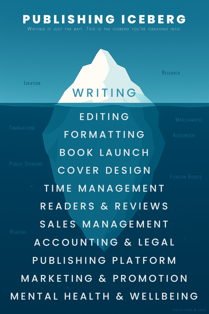
It’s the visible tip of the iceberg, smugly floating above the surface, soaking up the praise and admiration. Meanwhile, everything else – the sleepless nights, the decimal-point royalty statements, the unpaid invoices to your own soul – is lurking beneath, waiting to sink your mental health like the HMS Delusion.
So here it is, for posterity and pity:
Post-Writing Gauntlet: The Real Job Begins
1. Editing (Five Times, If You’re Lucky)
- Developmental editing – “Is your plot a plot or a pile of wet spaghetti?”
- Line editing – Making your sentences less embarrassing.
- Copyediting – Catching your consistent misuse of ‘affect’ and ‘effect’.
- Proofreading – The last defence against the typo apocalypse.
- Beta feedback – Friends who suddenly vanish when asked to read a draft.
2. Formatting and Typesetting
- Print vs digital layouts. Word crimes meet paragraph crimes.
- EPUBs that break for fun.
- That one widow on page 243 you didn’t notice until the proof copy arrived.
3. Cover Design
- DIY, Fiverr roulette, or mortgage your cat to hire a professional.
- Matching tone, genre conventions, and market expectations.
- Spelling your own name correctly. (Don’t laugh, it happens.)
4. ISBNs and Metadata Hell
- ISBN purchases (if you’re not relying on Amazon’s identifiers).
- Title, subtitle, BISAC categories, keywords, blurbs, author bio — all rewritten seventeen times.
5. Publishing Platform Setup
- Kindle Direct Publishing, IngramSpark, Kobo, Draft2Digital, Smashwords — pick your poison.
- Print proofs, bleed settings, trim sizes, the baffling difference between matte and gloss.
6. Marketing (a.k.a. Screaming Into the Void)
- Author website & blog (SEO: your new religion).
- Social media presence — the façade of charm over existential dread.
- Newsletter with a totally non-spammy freebie opt-in.
- Ads: Amazon, Facebook, Instagram, Google. Burn money to test the water temperature.
7. Book Launch
- ARCs, blog tours, launch events, or at least pretending you’re doing those things.
- Coordinating reviews before anyone has read the damn thing.
- Press kits and media outreach — basically shouting “LOOK AT ME” with tact.
8. Ongoing Sales Maintenance
- Price promos, countdown deals, boxed sets, bundling — keep flogging the corpse.
- Monitoring sales dashboards like a Victorian ghost watches the wallpaper peel.
- Adjusting metadata because one reviewer didn’t understand it was satire.
9. Audiobook Production (If You Hate Money)
- Narrator auditions, contracts, studio time.
- Alternatively, read it yourself and discover your own voice is intolerable.
- Or muddle through with an AI speech companion. Hullo, ElevenLabs.
- Distribution through ACX or Findaway, both of which will pay you in dry leaves.
10. Accounting and Legal Fuss
- Tracking royalties across platforms.
- Filing taxes as an “author-publisher-entrepreneur-marketer-entity”.
- Copyright registration, contracts, intellectual property trolls under the bridge.
11. Dealing With Readers
- Responding to fan mail (both lovely and deranged).
- Ignoring 1-star reviews that say “not what I expected, didn’t read it”.
- Navigating book clubs who want a discount because they’re “doing you a favour”.
12. Mental Health and Motivation
- Impostor syndrome, burnout, elation, despair — the writer’s buffet.
- Rewriting your author bio weekly because you don’t know who you are anymore.
Optional Add-Ons (for masochists)
- Translations and foreign rights – Because English isn’t the only language in which you can fail to sell books.
- Merchandise – T-shirts nobody buys, mugs that mock your financial situation.
- Public speaking / readings – Summon the courage to read your sex scenes aloud in a room of pensioners.