Cross-Post: confused AI Authorship

1–2 minutes

People keep hurling accusations of AI-assisted writing as though it’s the new literary scarlet letter. Apparently, if a sentence lands too cleanly or an argument isn’t held together with chewing gum and vibes, someone’s bound to whisper that silicon fingers were involved. It’s all very witch-trial chic.

Video: My minion scribing this blog post. I want to teach it how to use a typewriter.

I’ve written about this on Philosophics. Not the tired panic about ‘machines stealing our jobs’, nor the hand-wringing about entry-level writers having their ladders kicked away. That’s a separate tragedy. My post digs into the moral melodrama over authorship itself, where a whiff of algorithmic contribution is treated like doping at the Olympics. As if writing were a pole-vault and not, you know, communication.

The whole spectacle reveals more about our Enlightenment hang-ups than about the technology. We still cling to this myth that pure, unadulterated human genius trickles from the fingertips of a lone, caffeinated scribe. Anything less than “authenticity” gets branded synthetic, corrupt, impure. It’s the same script modernism’s been peddling forever, only now the villain has LEDs.

Anyway, if you’ve got the stomach for a short polemic on why these accusations miss the point entirely, here it is:

Have a look before someone claims an AI wrote it.

What’s With the Violet Aliens?

🛸 A Closer Look at the Cover of Sustenance

👽 People ask me: What’s with the aliens on the front cover of Sustenance?
Fair enough. Let’s talk about it.

Sustenance is set in Iowa – real, dusty, soybean-and-corn Iowa. I’ve spent months there. I’ve lived in the Midwest (including Chicago) for over a decade. The farms, the tractors, the gravel roads… they aren’t just set dressing. They’re part of the book’s DNA.

So, yes: we’ve got the requisite red barn, green tractor with yellow wheels (hi, John Deere 🚜), and a crop circle or two. The audiobook cover even features an alien peeking out of the barn – though logistics are holding that version back for now.

But those aliens…

If the composition feels familiar, it should.

The cover is a quiet parody of Grant Wood’s “American Gothic – a pitchfork-wielding farmer and his companion, stoic before their rural home. It’s one of the most recognisable paintings in American art, and I couldn’t resist twisting it just slightly. Grant was an Iowa boy.

I designed this cover using a flat vector art style, almost like cut paper or stylised children’s book illustrations. The sky is cyan, the land is beige, and everything is built in clean layers: barn, tractor, field, crop circle, and of course… two violet, large-eyed aliens striking a pose.

But no, this isn’t a literal scene from the book. You might encounter violet aliens in Sustenance, but you won’t find them standing around with pitchforks like interstellar Grant Wood impersonators. The image is meant to evoke the tone, not transcribe the events.

Why this style?

Because the story itself is quiet. Subtle. Set in the kind of place often overlooked or written off. The aliens aren’t invading with lasers. They’re… complicated. And the humans, well, aren’t always the best ambassadors of Earth.

The cover reflects that blend of satire, stillness, and unease.

Oh, and one last note:
🛑 No aliens were harmed in the writing of this book.

Needle’s Edge Cover Reveal

I’m sharing a comp of the cover art* for my upcoming novel – a story about a prostitute. More accurately, it’s a story about prostitutes, addiction, survival, and the consequences of living at the periphery – not just of society, but of personhood itself.

The earliest notes I have are dated 2019. I finished the first draft in June. I’m now editing – both structurally and line by line, which is probably a bad idea, but here we are. Because I’m reorganising scenes, I need to ensure the transitions make sense, emotionally and narratively.

Since completing the draft, I’ve been reading Simone de Beauvoir’s The Second Sex. First published in 1949, the edition I’m reading was translated in 2011. It’s given me language for something I was already trying to do.

This line is central to my approach. My protagonist isn’t born a prostitute. More importantly, she isn’t even born a woman. She’s made into one by church ladies, jealous sisters, careless boys, and indifferent systems. Through gestures, punishments, expectations, and neglect. Through the crucible of a society that offers her a script before she understands the stage.

Yes, her psychology matters. But the world matters more.

That’s what I’m trying to explore — not just the facts of a life on the edge, but the forces that shape it.

* I’ve actually designed two covers – one for hardcover and the other for paperback. It provides me with options.

Behind the Binding: Sustenance in Print, Pixels, and Purgatory

Not quite a launch. Not quite a rant. Just one author trying to get a novella into the world without sacrificing too many hours or brain cells.

Paperback Problems

I’ve been writing quite a bit lately—several novellas/novelettes, to be precise.

They all began life as short stories, but brevity doesn’t come naturally. Apparently, I can’t shut up even on the page. I toyed with the idea of releasing a thematic collection, and I still might. But for now, Sustenance is getting its own debut—likely this month.

The book clocks in at around 14,000 words, printed across 144 pages. I’ve read that readers prefer novels to novellas, but I’ve also read that readers don’t really read anymore. Time’s short. Attention spans are shorter. Maybe shorter fiction has a fighting chance. We’ll see.

I formatted it in 6×9 inches, which may have been overly generous. It’s leaner than your average indie fantasy tome but still thicker than my last Žižek collection. So there’s that.

The manuscript began in Word, like every poor decision. I laid it out in InDesign and exported the PDF through Acrobat. No budget, so I designed the cover too—started in Illustrator for the vector charm, but ended up in Photoshop, where I’m more at home. I designed the full wrap—front, back, spine—as a single canvas.

This was a mistake. More on that later.

Still, I’m pleased with the final look. Might reuse the style across future novellas for a bit of visual branding. There’s barely enough of a spine to print on, but we suffer for aesthetics.

Proofs arrive Thursday. Fingers crossed.

Hardback Headaches

Then came the hardback edition. Same 6×9 size, same interior. Should’ve been simple.

It wasn’t.

I forgot (again) that hardbacks require extra bleed and margin space. Couldn’t just resize the existing cover without risking pixelation. If I’d stuck with vectors, this would’ve been a breeze. Instead, I got to rebuild the entire layout from scratch—layers, guides, grids, the lot.

Hours of joyous rework. Lesson learned. Until next time.

eBook Escapism (and Other Fantasies)

Converting the layout to eBook format was a slow-motion trainwreck. I’d inserted custom font glyphs above chapter titles in InDesign. They rendered fine—until they didn’t. Halfway through, chaos reigned.

I cracked open Sigil and manually edited the XHTML. So far, so fiddly.

Then I uploaded the .epub to Amazon. Except Amazon wanted a .kpf file. Of course it did.

Enter Kindle Previewer. Except it doesn’t support embedded font glyphs. So I converted them to SVGs.

Still no dice. Kindle’s rendering engine is older than most of its readers. SVGs failed too. So I converted every glyph to PNG, rewrote the CSS, rebuilt the XHTML again, and gave it another go.

Looks fine. Not perfect. I gave up.

They’re just decorative anyway. No plot-critical glyphs here.

The Kindle version should go live shortly. I enrolled it in KDP Select, which means 90 days of exclusivity in exchange for a modicum of convenience. After that, I’ll look at wider distribution.

For the eBook cover, I simply cropped the original layout in Photoshop. That part was, mercifully, straightforward.


What’s Next?

This post is more documentation than declaration. A sort of production diary. I’ll follow up with an actual announcement when the book launches, plus a few reflections on themes, characters, and that moment when you realise your protagonist may have accidentally sexed up a chicken.

Long story.

Anyway, this is just the start. Stay tuned.

Or don’t. Up to you.

Temporal Babel: A Novelette

I just completed a second draft of a novelette I’ve been working on. I had ChatGPT (Dall-E) render a quick sample cover.

The story takes place in New Mexico, and I wanted a minimalist visual style to match the prose. I believe that a beige desert set against a blue sky is perfect. The deserted highway with a single cactus speaks volumes. The footprints in the desert are also evocative. I love the simplicity of the palette.

Though it revered the front and back cover art, it generally followed my instructions. Artificial intelligence (AI) has made significant progress in a year. All of the words are spelt correctly. I could Photoshop this into shape with little effort.

I only plan to release this as an ePUB because I am compiling a triptych. Currently, the body copy stands at 105 pages, so with title pages and the rest, it should reach 112 pages, which is perfect for seven 16-page signatures.

Barely Audible

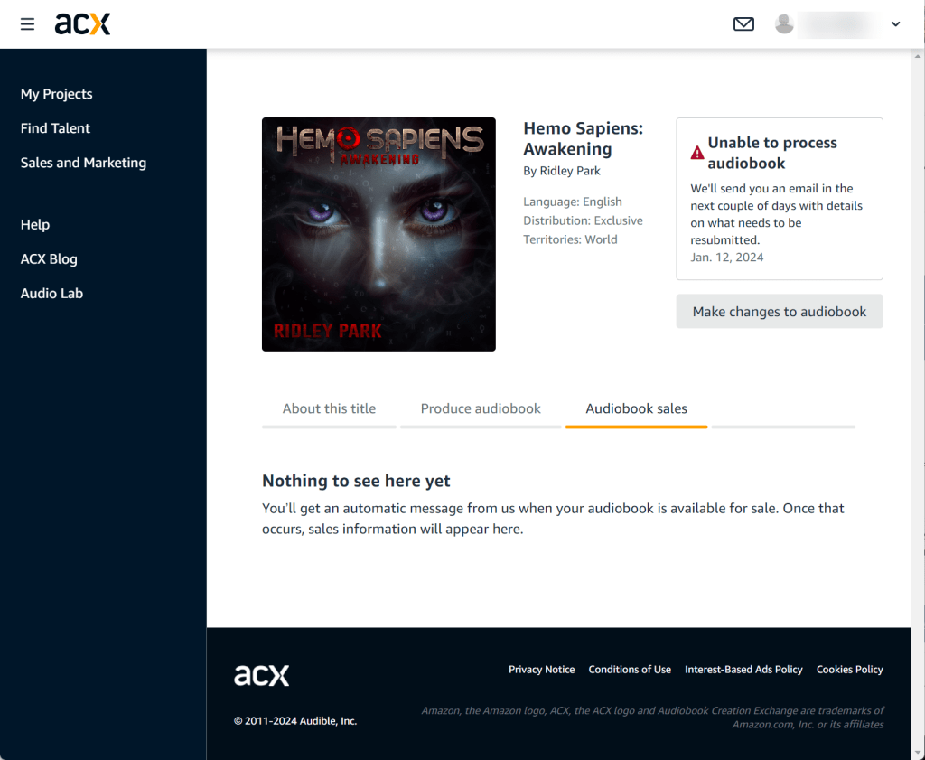
So this happened. I submitted Hemo Sapiens: Awakening as an audiobook, and it was rejected. The site says that they’ll let me know why in a couple days. My question is: if you rejected it, don’t you immediately know why?

I think I know why, but I can’t ‘fix’ the problem if I don’t know what it is. I don’t want to act on an assumption.

I believe they’ll inform me that I can’t use AI-generated narration. This would be odd because they have a programme in Beta where they provide the service of automatically converting the text of a book to audio. To be honest, it doesn’t sound amazing. It appears that they are using their own Amazon Polly, which I like, but you need to babysit it hard. It is very unlikely to sound good without heavy hand-holding. As it is, I hand-held my ElevenLabs AI to make the outcome sound like a professional human.

Audible offers some voiceover actors, but I didn’t like any of them, and they couldn’t compete with my ElevenLabs voice. I can understand that they don’t want to sell audiobooks that sound like Stephen Hawking, but theirs sound closer to him than mine.

On another note, I had to render and upload square cover art. There was a stated restriction disallowing padding a rectangular cover image with space or colour to make it square. I followed this rule, but this is exactly what they do. They take the cover of the book you’re selling through Amazon, and they pad the left and right margins with filler colour. I may append the rationale they provide once I’ve received it. Until them, my audiobook is on hold.

Thanks to India

I’d like to thank the person in India who earned me $0.02 by reading 17 Kindle pages of Hemo Sapiens: Awakening. Reading on Kindle Unlimited is free—time aside. Read the whole book, and I’ve earned $0.50. In time, we’ll be as rich as astronauts.

Proof Positive

Mates, the proofing process was Hell. I even count the number of times I reviewed my book, Hemo Sapiens: Awakening. Then I sent it out to a couple of Beta readers, one of whom went over and above and did some proofreading, which I appreciated. I made some amends, and I ordered a proof.

The proof arrived relatively quickly—even without expedited shipping, which would have been more than twice the price of the book.

Lessons Learnt

  • Get a proof copy of your book
    Don’t skip this step. It’s inexpensive and is key to assessing formatting issues. It is also an opportunity for last-minute proofreading. I discovered probably 4-dozen nits that slipped through the cracks.
    • Layout
      In one case, I had an indefinite article (a) orphaned at the end of a line. I entered a soft return to get it to start on the next line to enhance readability.
    • Cover Art
      Silly me. I designed and composited the cover, and I didn’t hide the bounding rectangles I used to reference how my cover, back, and spine present. My proof copy has these rectangles in place. It’s not a huge issue, but it is an aesthetic flaw that I corrected.
    • Major Misses
      This is not as likely to happen to most authors, but this books began its life as four or five short stories that were in the same universe on a shared timeline, so I decided to add connective tissue and create a novel. The problem is that the short stories were set in Bristol, London, and Manchester, but I needed to set the novel in a single location, and I chose Manchester. A beta reader noticed that I even though the story was in Manchester, I left a scene having a character reflecting on the Thames, which is a feature of London. I changed it. Unfortunately, there where two instances. I was lazy, and I changed the instance they pointed out to a generic ‘river’, but I left another instance as ‘the Thames’. Oopsie.
    • References
      Another issue I caught is again fairly unique. I wrote out a male character and offloaded his scenes to a female character. I decided that I didn’t have enough material and differentiation for the two characters. It sounded good at the start, but he didn’t make the final cut. The problem is that I missed a few ‘his’ to ‘her’ pronoun swaps. Oops.
    • Punctuation
      Man, I missed a lot of question marks and a few commas. Nothing major, but it matters.
    • Spelling
      OK. Not too many here, but I had swapped a wonder for a wander that I missed the first hundred times through.
    • Spacing
      Again, minor formatting issue. The biggest offender was rogue spaces between en-dashes and trailing commas: – , instead of –,. It’s a little thing.
    • Tenses and POV
      This book was written in third-person, present, limited, deep point of view. Or that was the goal. All too often, I would slip into past tense. In some cases, it might have been OK, but I edited a lot back into present tense.

      I also switched several times out of limited into omniscient. To be honest, I left some of this alone.

      I was also guilty of some incidental head-hopping. Sue me. It happens.
    • Create Your Audiobook First
      OMG. I thought I was done, but I found so many small issues when I was forced to micro-focus for the audio version. It helped so much. I have been told to read your book out loud—advice I follow—, but I still uncovered a treasure trove of mistakes in the audio version. Moreover, some things that didn’t sound awkward earlier, now did, so I had the opportunity to change it up.
    • Last Minute Amends
      As it happens—in line with the audio version advice—, feel free to make more substantial content amends. My favourite one. When I heard this line during an audio review—I was literally listening in bed—, I got up and changed it immediately.
      • Before: When they arrive at the compound all is quiet except for the crickets that pause to listen.
      • After: When they arrive at the compound all is quiet except for the occasional cricket.
    • Obviously, crickets pausing to listen are also quiet, so…
  • Give yourself time enough time to do a thorough review
    I set a 1 March release date, so I left myself plenty of runway to take off.
  • Be patient
    Even though I gave myself plenty of time for review and amends, I rushed the process and approved a book that wasn’t ready for approval and had to do late revisions.

I”ve probably not mentioned some, but I had the opportunity to fix each of these mistakes, so I’ll bookmark this page and my next book will be that much easier to publish.